 Issue № 386
Surveying the Big Screen
by Mike Pick Published in Layout & Grids, Mobile/Multidevice, Responsive Design
With over three years of responsive web design in our collective portfolios, we now have a solid set of design patterns for making websites work on small devices. But what about larger screens?
Editors note: This article is an experimental layout of Surveying the Big Screen, originally published as part of A List Apart Issue 386. To view this demo to best effect, a screen resolution of 1680x1050 is recommended, as well as a browser that supports CSS3 columns.
It’s become common for sites to employ a liquid design for smaller breakpoints, which allows the content to expand and contract as necessary to make the most of the available screen width. At the opposite end of the spectrum, however, many of those same sites have a maximum width of 960 pixels or so, which can leave a lot of unused pixels on a contemporary desktop display.
Designing for the big screen can be complicated—negative space, scale, density, and layout devices such as grids, modules, and columns can be factors in managing hierarchy and emphasis.
Large screens are also generally shaped in a wide landscape orientation, a poor fit for the traditional vertically scrolled webpage. As with smaller screens, there are a wide variety of screen sizes and resolutions—but in the case of larger screens, the differences are often magnified, ranging from ultra-light 11-inch laptops to 30-inch desktop monitors.
Given these conditions, it’s not surprising that many desktop layouts (like this one) are designed to suit a 1024x768 resolution. It’s a leftover from an earlier era, when designs were constrained to the screen resolution that was most prevalent amongst users. Today, with the majority of desktop users on screens that are wider than 1024 pixels, a maximized browser window can turn that carefully considered 960-pixel layout into a monolith in a field of whitespace.
More people are accessing the internet with a mobile device every year, and so it makes sense to concentrate budgets and timelines on creating good user experiences for smaller screens. Mobile layouts can be perfectly usable on larger devices, but the same cannot always be said for desktop layouts viewed on small screens.
But by embracing large screens, designers have the opportunity to work within a larger fold, presenting the user with more content simultaneously, lessen scrolling on longer pages, and create a richer, more expansive user experience. And by using the same practices we developed to adapt layouts to smaller screens and identifying some common patterns for large screens, we need not necessarily introduce extra cost or time to our projects.
Content challenges
As with any design, the first consideration when approaching larger breakpoints is content. Long- and short-form writing, photography, ecommerce, video, or web applications may benefit from different approaches in different ways.
Photography, search results, and other content presented in grid format are easy candidates for wide screens. Showing as much content as the screen can accommodate allows a user to quickly scan and compare results.
On the other hand, long-form reading is a challenge for wider breakpoints. Long line lengths can make it difficult to follow the text from line to line, while short line lengths can introduce a sense of jumpiness or acceleration, breaking a reader’s rhythm and pacing.
To make reading more comfortable, a designer needs to balance the width of the text column (the measure) against the size and line-height (leading) of each line of text. Classically, an appropriate count for a single column of text is seven to 10 words (Josef Muller-Brockmann) or 45 to 75 characters (Robert Bringhurst). Taken another way, Bringhurst also notes that the measure of a conventional book column is about 30 times that of the type size used, but that this number may also range from 20 to 40 times the size of the type.
Wider columns can use more line-height to make it easier to follow the text from line to line, but too much line-height can cause lines to drift apart, resembling a college research paper. Similarly, as the text size in a column grows larger, the number of lines that can be presented vertically on the screen grows smaller, increasing the need for scrolling and breaking the reader’s immersion. Simply scaling the text for larger breakpoints is a limited solution.
Working With Long Reads
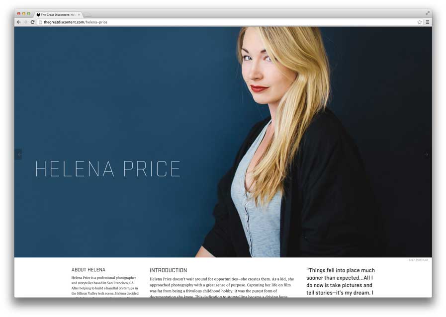
Long Reads:
The Great Discontent uses bold feature art at the top of each article to fill the viewport.
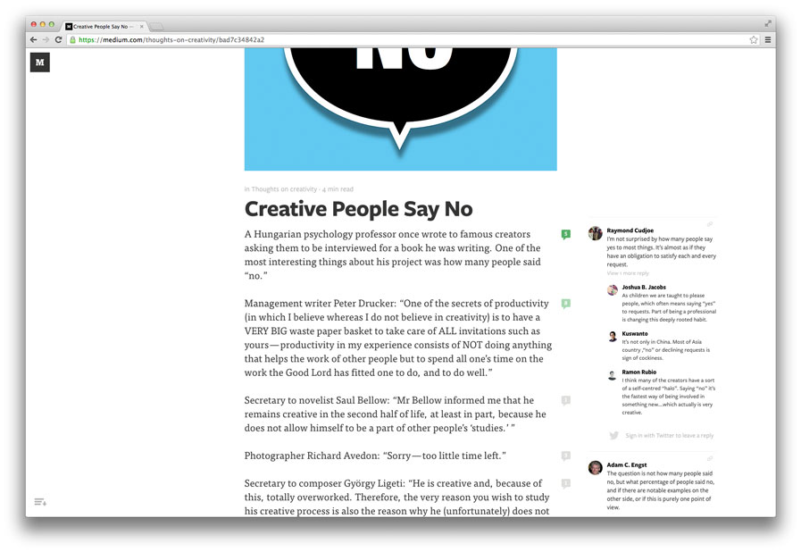
Long Reads:
Medium places comments contextually, in the extended right margin.
The Great Discontent demonstrates how a site can use art direction to adapt to larger screens without necessarily filling every single pixel in the browser window. Each article expands its feature art at the top to fill the viewport, resulting in a striking full-bleed effect upon first viewing. The main content of each article is set in a relatively narrow main column, but sidebars, pull quotes, and inline art expand beyond the central column. Breaking the content out of the main column creates an asymmetrical shape which complements the full-width artwork at the top—creating the illusion of a full-window experience without compromising legibility. Large images like these can come at a cost, though, as a balance between image quality and the overall page weight needs to be considered.
The recently relaunched Roger Ebert site deals with large breakpoints by simply scaling up the maximum width of the page and the page elements proportionately. In theory this might work, but the execution is not entirely successful. Elements such as headers scale up vertically as well as horizontally, meaning the amount of content displayed within the fold is drastically reduced.
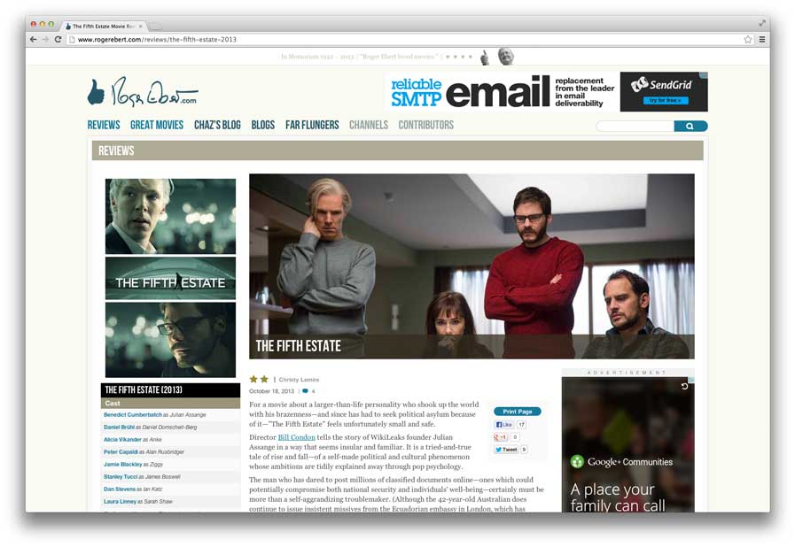
Long Reads:
The Roger Ebert site scales up most page elements, reducing the visible content.
Inexplicably, main body copy on the more text-heavy pages does not scale up in proportion to the other page elements, so it seems dwarfed in comparison, in addition to being set in a size that is too small for the main column measure.
Using the extended margins of larger screens for related or tangential content, such as Medium’s comments layout, is another idea that seems well suited for long-form publishing. When the main content column is maximized on smaller screens, it moves aside to reveal the comments area; on larger screens, the comments are revealed in the available margin space.
I’ve also always liked Grantland's use of the lower right column for footnotes, which takes advantage of wider screens while maintaining focus on a readable central column. Photographs, figures, asides, quotes, and other related content can be extended out into the margins of wider viewports. This allows a designer to extend the vertical grid outward to create variety while preserving the flow of the main text.
Newer CSS features like columns and regions could be useful tools to enhance long-form reading on wider screens. CSS-based columns are now supported across most new browsers, and could be deployed within sections of an article to maximize screen usage while maintaining a good measure for text readability, as in this layout.
As a progressive enhancement measure, older browsers that do not support these features could be restricted to a single column of appropriate measure.
Chunking content on large screens
Breaking content into chunks allows users to quickly and efficiently process information on content-heavy pages, and it’s a natural fit for responsive designs, because it allows content to be easily stacked hierarchically or arranged in columns for different breakpoints.
The advantage of this technique for large screens is that each chunk or band of content can use a different layout to optimize for legibility or impact. A good example of this approach is the Manchester City Council site, which uses different groups of modules in restricted widths together with a full-width photography chunk to create impact and emotion. The layout adapts fluidly to different viewports while retaining an appropriate width and layout for the content of each chunk.
Juliana Bicycles uses a more visual approach to content chunking, combining horizontal bands with flexible tiles to create a rich and compelling responsive site that also scales to large screen widths. Navigation is recast as a full-window carousel with rich background photographs. Content is presented in modular blocks, and gutters that appear between tiles are removed in tablet and mobile screen sizes. A paper texture background fills in empty tile spaces and also helps fill out the screen at the largest breakpoint. Using image-based modules in this way can be expensive from a bandwidth perspective, but is a great way to get the user to navigate quickly by showing rather than telling.
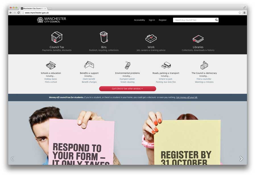
Content Chunks:
Manchester City Council and content chunks.
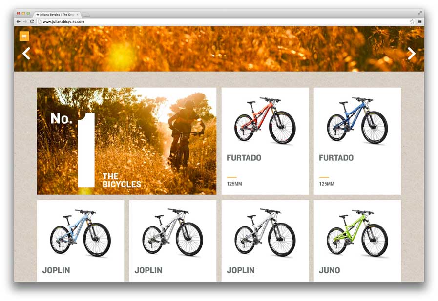
Content Chunks:
Juliana Bicycles treats content chunks more visually.
Tiling modular content
The obvious advantage of a big screen is the ability to see a lot of content at one time.
With collection-based content such as photos, tiling can be an effective way to to fill large screens. We see this every day when searching Google Images—the results spread out to fill the viewport, presenting a large variety to choose from in a single scan.
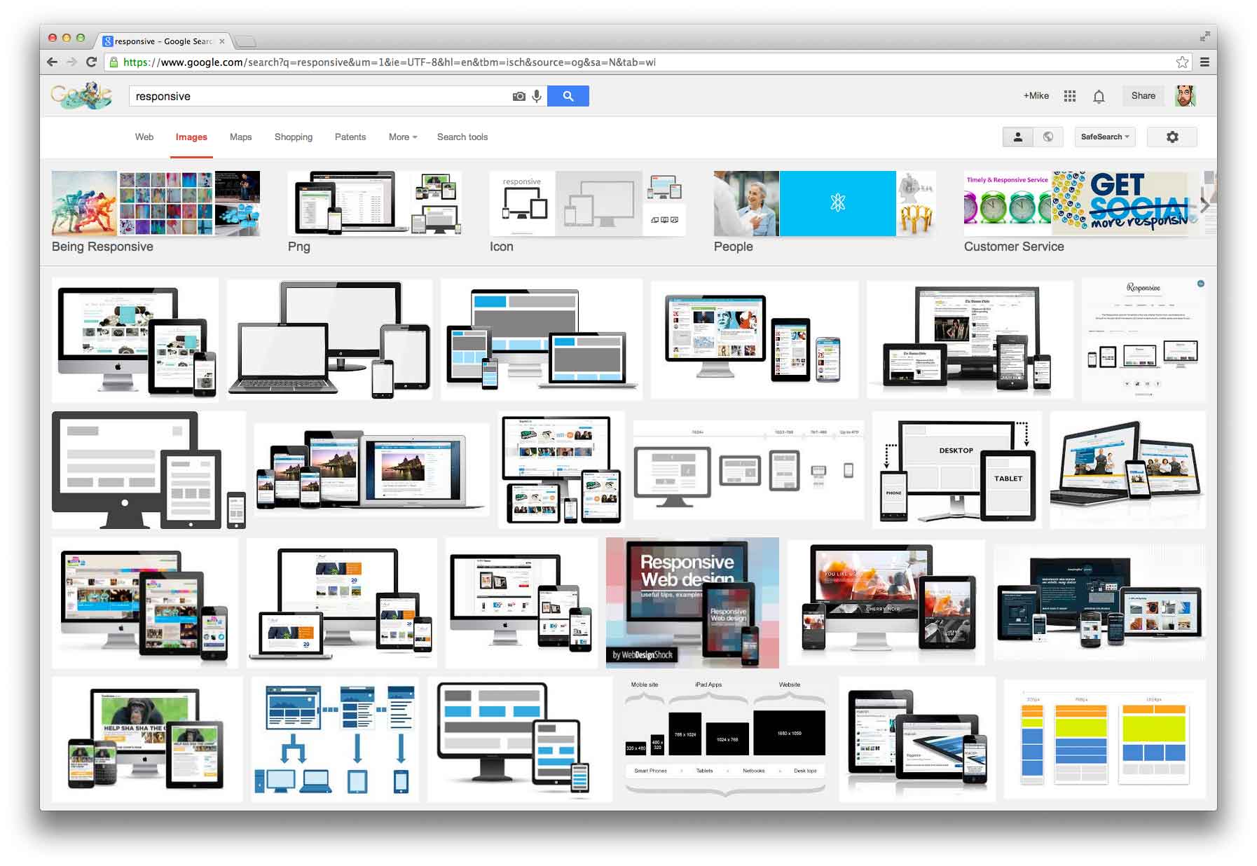
Tiling Content:
Google Images shows as many images as possible in the viewport.
Pinterest also uses a tiling layout for images, with the addition of text and whitespace to mitigate what could be an overly busy layout. On larger screens the image preview modules seem to tile indefinitely. For a collection site, where the user experience is about quickly collecting and marking favorites, filling the viewport with thumbnails makes it easier to scan and creates a satisfying sense of fullness.
Uniqlo uses a wide, tiled-image layout that also looks well-designed and spacious. Items are chunked together with large headers acting as bumpers between sets to add breathing room. Tiling the products across a wide area allows shoppers to quickly compare items visually. At the same time, the whitespace, model photos, and variety in scale add refinement to the overall look and feel and help reinforce the point that design is an important differentiator in Uniqlo’s product line.
Neither Pinterest nor Google Images are responsive or adaptive sites—they both employ a separate site for mobile users. Uniqlo is also only adaptive to larger screens; small screens get the narrowest desktop layout. While these sites may not be complete models for responsive design, we can look at them as examples for expanding this type of content.
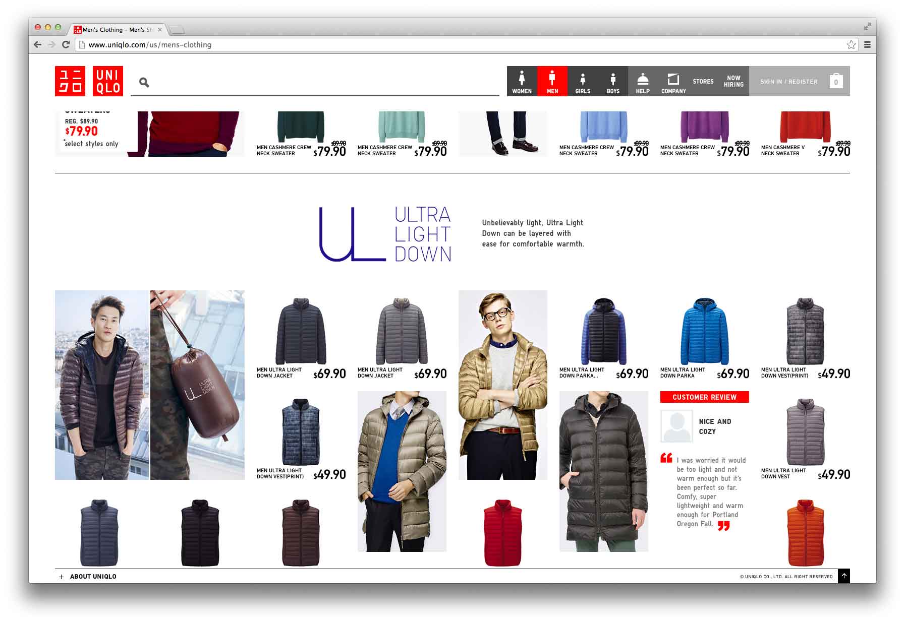
Tiling Content:
Uniqlo's wide view allows shoppers to compare items visually.
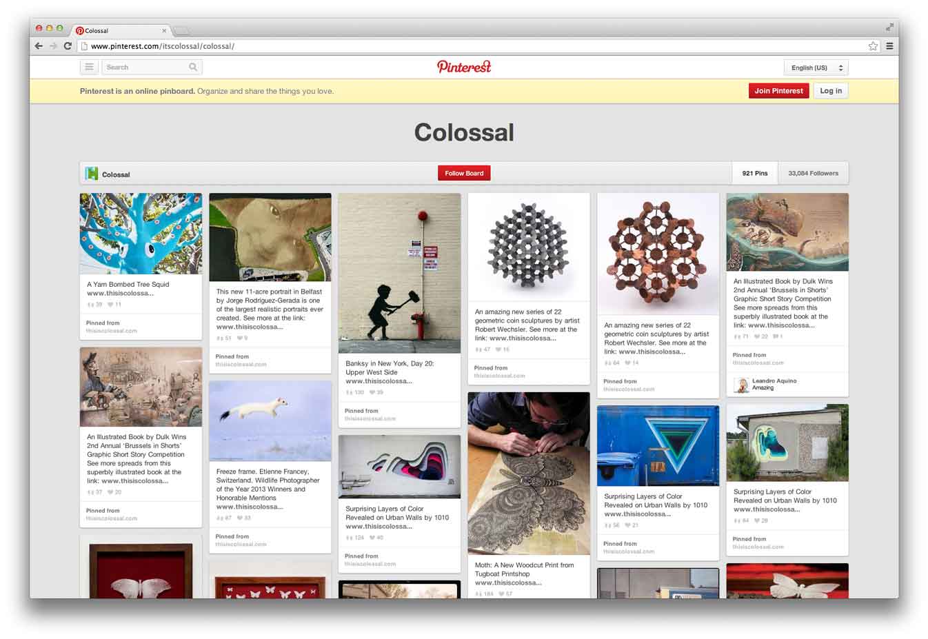
Tiling Content:
Pinterest’s tiled pages play to the scrapbooking or collector metaphor.
Graphic techniques
Another interesting technique for larger screens is based more on classic print design, rather than restructuring or manipulating content to fill the browser.
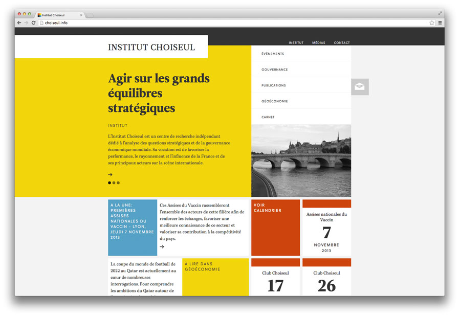
Institut Choiseul confines the content of each page to a structured grid in the center of the window, but effectively stakes out a large screen presence by extending a field of color from the logo and main page content outward toward the left edge of the viewport. The Back to Top link appears in the lower left corner of the viewport when the page is scrolled, a small touch that stakes out the entire window for the page. The strong grid and large fields of color give the site a sober, logical tone that evokes the International Design style of the 1950s and 1960s.
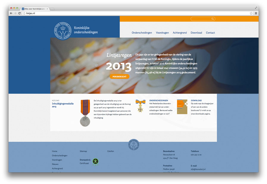
Kanselarij der Nederlandse Orden has a similar style, with asymmetrical bands of color that provide the background to a centered flexible grid. Because the grid expands as a percentage of the total window width, the content also plays a part in filling the screen, but the boxy color fields add a level of sophistication to what is otherwise a fairly ordinary layout.
Small effects such as a color tone or texture in the background, or removing boxy lines from the edges of a layout, can go a long way toward creating a sense of completeness in the maximized window. Creative use of asymmetry instead of skinny, tower-like layouts can also keep readers from drowning in white margins.
Graphic techniques:
Elements in the grid extend to edges of the window at Institut Choiseul.
Graphic techniques:
Kanselarij der Nederlandse Orden frames a flexible central grid in asymmetrical bands of color.
Finally
By simply extending common techniques for adapting content to smaller breakpoints, we can see plenty of opportunities for larger breakpoints as well. Sites that use a strong grid will have an easier time of it, as a well-structured grid should have no problem expanding into a wider space.
Obviously the most important consideration in any design is the content, and so that must be the basis for any effort to expand a design to fill a wide screen. For long reads, it’s more important to create a good rhythm and flow so that the text can be read without distraction. For photographs or graphics, space and scale contribute directly to impact. Government and service-oriented sites must provide easy access to tasks and information. Ecommerce sites need to make it easy for consumers to evaluate and purchase products. A layout’s density should reflect the site’s tone—more density for a more active experience, less for a slower, more thoughtful tone. Much like framing a photograph, filling out the viewport can make a design seem bigger and bolder, just as framing a design in generous whitespace can make it seem more elegant or precious.
It may be true that desktop users have the luxury of resizing the browser window if all that whitespace makes them uncomfortable, unlike users of smaller devices. It may be also be true that not all desktop users browse with large or full-screen windows. But as with mobile, we shouldn’t make assumptions about which devices are used to view our content now, and especially in the future. Large screens, in some cases, can provide both enhanced usability for users and a richer palette for designers. It’s up to us to take advantage of these expanded borders.